In our ongoing discussion about the state of modern Graphical User Interfaces, it's worth taking a moment to reflect on what made older operating systems, particularly Windows 7 and its predecessors, so remarkably effective and beloved by many. For a generation of users, these systems represented a pinnacle of desktop computing, characterized by a design philosophy that prioritized the user's control and productivity above all else.
Lightweight and Responsive: A Breath of Fresh Air
One of the most striking differences between older OSes and their modern counterparts was their inherent lightweight nature. Windows 7, for instance, could run smoothly on hardware that today would struggle with a basic web browser. This wasn't just about system requirements; it was about the operating system getting out of your way.
-
Fewer Background Processes (and Greater Security): Older systems were far less burdened by a multitude of background processes and services constantly consuming resources. There was less telemetry, less bloatware pre-installed, and a clearer understanding of what was running on your machine. This meant more RAM and CPU cycles were available for your applications, leading to a snappier, more responsive experience. Crucially, fewer running processes and services also meant a smaller attack surface, inherently leading to fewer potential exploits and vulnerabilities for malicious actors to target.
-
Faster Boot Times and Application Launches: Without the overhead of countless background tasks, these systems often booted up quicker and launched applications with a satisfying immediacy that is often missing today. The feeling of instant feedback contributed significantly to a sense of control and efficiency. Even on a Hard Disk Drive they felt snappy, where as newer operating systems like Windows 10 or 11 require a Solid State Drive just to be usable.
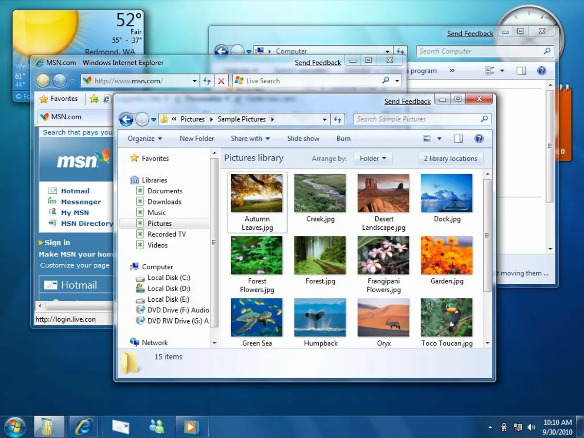
Clear, Consistent, and Intuitive Navigation
The desktop experience in Windows 7 was a masterclass in clarity and consistency.
-
The Start Menu: The classic Start Menu was a central, predictable hub. It provided quick access to programs, documents, and system settings in a logical, hierarchical manner. You knew where everything was, and finding something new was a matter of intuitive exploration, not a search query.
-
Desktop as a Workspace: The desktop truly felt like a personal workspace. Icons were where you put them, and they stayed there. Widgets and gadgets were optional, not forced. It was a canvas for your work, not a dynamic billboard.
-
Predictable Window Management: Windows behaved predictably. Resizing, moving, minimizing, and maximizing were straightforward. Aero Snap (introduced in Windows 7) was a perfect example of a feature that genuinely enhanced productivity without adding complexity or visual noise.
-
Clear Visual Cues: Elements had clear borders, subtle gradients, and distinct states. Buttons looked like buttons, and clickable areas were obvious. This visual clarity reduced cognitive load and made the interface easy to understand at a glance, minimizing the need for constant re-learning.
User Control and Transparency
Older operating systems offered a greater sense of user control. Updates were often less frequent and, crucially, more optional. You had more say over what ran on your machine and when changes were applied. This fostered a sense of ownership and stability, allowing users to master their environment without fear of arbitrary disruption.
While technology must evolve, there's a valuable lesson to be learned from the design principles of Windows 7 and older systems. They remind us that true usability comes from being lightweight, predictable, and empowering the user, rather than overwhelming them with visual noise, forced changes, and hidden complexities. Perhaps it's time for modern GUI designers to take a page from the past and prioritize clarity, efficiency, and respect for the user's workflow once more.